The trend towards responsive design in eCommerce over the last 18 months has been quite incredible to watch. Many web developers had already been practicing it but integrating it into ecommerce had proven a lot harder. Ecommerce sites are typically much larger with more complex navigation and user tasks, e.g. product filtering and the checkout process. While there are still plenty of challenges in front of us, we have seen it become the preferred method of offering a great experience over a wide range of devices.
History
At Meanbee we have been pushing our technical expertise forward and one of those has been in responsive design. We are grateful to have been invited to Meet Magento conferences to share our experiences. The slides of which are available on speakerdeck.
As part of these talks with Darren Belding I conducted some quick research a year ago into understanding how many sites were actually using this technique. The prototype was counting the occurrences of media queries within CSS files. After looking through the results and checking a sample, a count of 5 or more was considered to be a reasonable indicator of responsiveness. This resulted in statistics such as 1% of ecommerce site being responsive and 66% of those were based on Magento.
Latest Responsive Survey
This was somewhat rudimentary though, so using the April 2014 eCommerce survey results, I built on the prototype to improve accuracy. I did this in a number of ways including:
- Only looking for min-width and max-width media queries
- Blacklisting some libraries, e.g. flexslider, that include their own media queries
- Ignoring media queries that were empty or only had one css statement.
- Checking link HTML elements for media queries.
It has been a year since the last ecommerce survey and there has been massive growth in it with an even wider range of platform detection. This edition found 46,859 sites within the Alexa Top 1 million to be running on a known ecommerce platform. This is an increase of 34% since February 2013.
Results and Analysis
The survey found just shy of 8000 results. This means that 16% of ecommerce sites queried were making use of media queries to optimize display on different size devices. This is a massive growth from a year ago when it was only 1%.
The sites that were detected to have used media queries were evenly spread over the top 1 million. Showing that it is not only the larger sites that are investing in it. The number of media queries used on each site is evenly spread through the top 1 million as well. This means that the size of the site does not dictate the technique they use to achieve responsiveness.
Most Popular Responsive Sites
A selection of the most popular responsive sites that were detected were:
disney.go.com (IBM WebSphere)
qvc.com (IBM WebSphere)
konga.com (Magento)
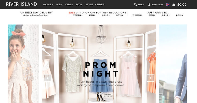
riverisland.com (Commerce Server)
galerieslafayette.com (Hybris)
A special mention should also go to theproteinworks.com and 883police.com for having over 250 and 300 media queries respectively! The highest amongst all ecommerce sites checked.
Most Popular Platforms to be Responsive
This leads us on to take a look at what platforms the sites are on that have chosen responsive design.
The leaders are (with their proportion of responsive sites):
- Magento (32%)
- WooCommece (22%)
- OpenCart (10%)
- Shopify (9%)
- Prestashop (9%)
Last year, Magento was at 66% so it has somewhat reduced in share even if the quantity of responsive sites has increased. One reason for this is likely to be the introduction of WooCommerce which was not previously detected and has a high proportion of responsive sites. Indeed, 30 out of 39 of the starter themes on woothemes are responsive.
Responsive Web Design with Device Experiences
This is where a responsive site is built but device experiences are created by detecting the user agent of the device and using a different template.
During sample analysis of the responsive survey results a number of sites were identified that had a number of media queries but showed a different theme to mobile devices. These sites were responding to different tablet and desktop sizes but offering a site variant to mobile devices.
There are two approaches to this. Some sites do this while keeping the same URL (regarded as better for SEO), e.g. Urban Outfitter. Meanwhile others redirect mobile customers to a mobile specifc URL e.g. Marks and Spencers and Warby Parker.
Limitations
It is difficult to automatically classify sites that have a low number of media queries (e.g. between 2-5). While it is possible to build a responsive site with media queries within this range it typically requires more. Also, a number of sites were using media queries to make very small changes on different devices but it could not be said that they had a responsive site.
Conclusions
It is clear to see that responsive design for eCommerce has seen enormous growth over the last 2 years. I can only see this trend continuing as more brands go through a redesign and rebuild cycle.
The next step for those already taking advantage of responsive design is making optimisations on the device level. This could be through device experiences or perhaps with the server side components technique. With careful use of user-agent detection, these can enable optimisations further to responsive design alone, e.g. performance or usability.


